Crafting for Contemplation: The Minimal vs. The Ornamental
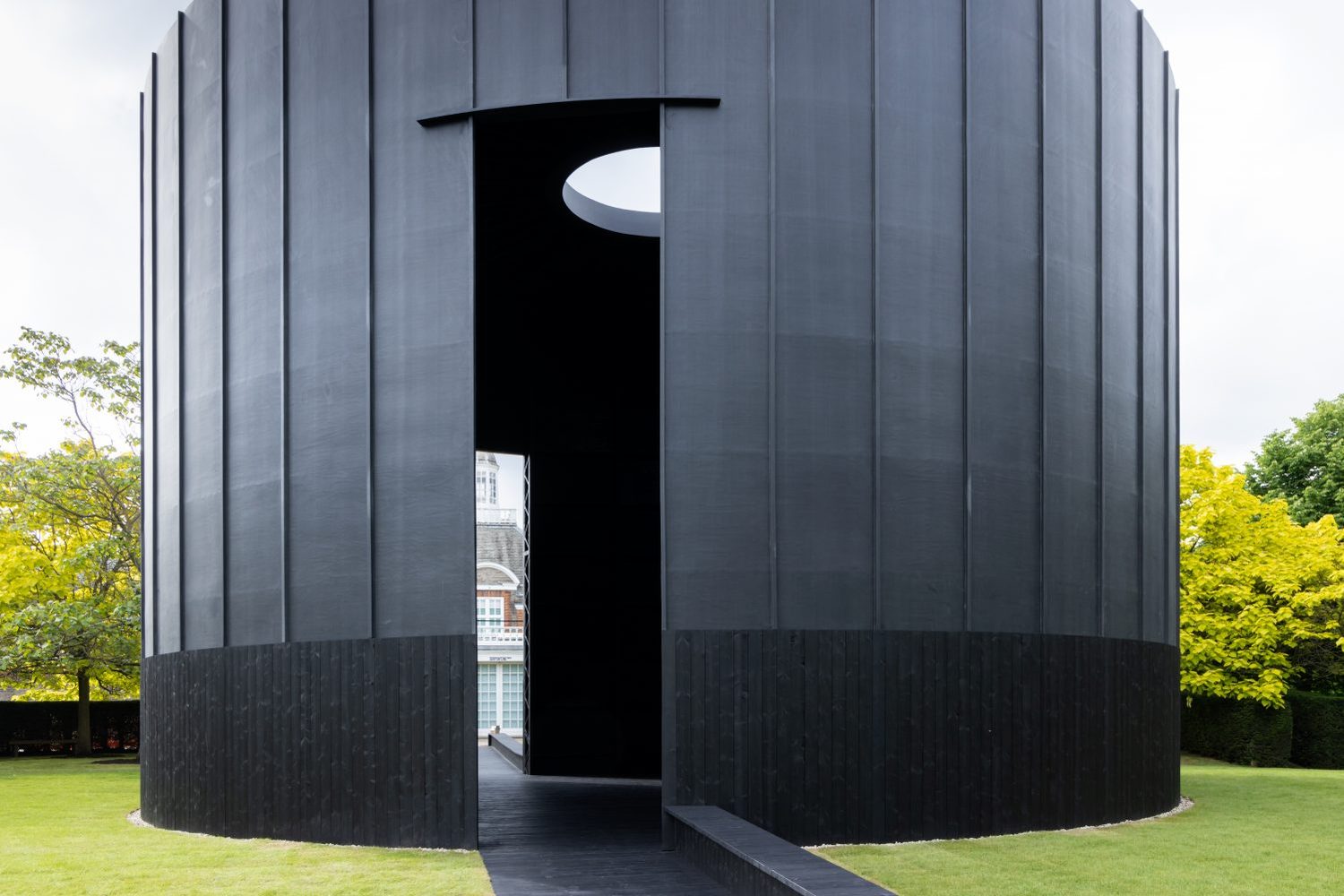
A few weeks ago, this year’s edition of the Serpentine Pavilion opened to the public. Designed by Chicago-based artist Theaster Gates, it’s an evocative project, its cylindrical form referencing American beehive kilns, English bottle kilns, and Musgum adobe homes found in Cameroon.
What the pavilion is named tells the viewer a lot more about its intentions as a spatial experience. Titled Black Chapel, it houses a spacious room with wraparound benches, and an oculus above that allows daylight to filter into the space. It’s a fairly minimal interior – designed as a site for contemplation and reflection. This minimal quality of Gates’ Serpentine Pavilion raises particularly interesting questions. How artists and architects opt for a “less is more” approach when designing meditative spaces, but also how these introspective spaces have been equally enhanced by ornamentation.


 Picture: Iwan Baan